“KHNP Visits E2S, the First Company to Achieve Independent Export to India’s Nuclear Power Market… Strengthening Shared Growth Cooperation”
First Korean SME to Enter the Indian Market... On-site Encouragement Through a Food Truck Event “Confirming the Competitiveness of K-Nuclear SMEs”... Expanding Shared Growth Through Tailored Support.
E2S Exports Nuclear Technology to India... "A First for an Independent SME"
-Signed technology export contract with India’s state-owned BHEL -Transfer of customized Excitation System technology -BHEL manages over 150 energy facilities across India -Reviewing joint production leveraging local manufacturing capabilities
E2S Enters Aging Nuclear Power Plant Maintenance Markets in U.S. and Japan
E2S is pushing for entry into the global market in response to the growing demand for aging nuclear power plant maintenance in the United States and Japan.
KHNP CEO Hwang Joo-ho Visits Partner Company E2S, Pledges "Close Communication"
Hwang Joo-ho, CEO of Korea Hydro & Nuclear Power (KHNP), visited partner company E2S to emphasize the strengthening of cooperation within the nuclear power industry. During the visit, he reviewed E2S's core control system technologies and promised closer collaboration and expanded support in the future.
CI System
The E2S CI is a brand asset that visually conveys technical completion, user-friendly clarity, and a future-facing sense of connectivity across data, technology, and people.
Brand Principle
Core values expressed through the CI
The E2S brand is built around precision engineering, scalable connectivity, and a stable sense of balance.
Technical Completion
Soft curves and angular geometry work together to express technical completion and a precise corporate image.
Connectivity
The flow between E, 2, and S symbolizes scalable connectivity where data, technology, and people form one network.
Balanced Identity
Stable proportions and restrained design create balance while reinforcing a dependable corporate impression.
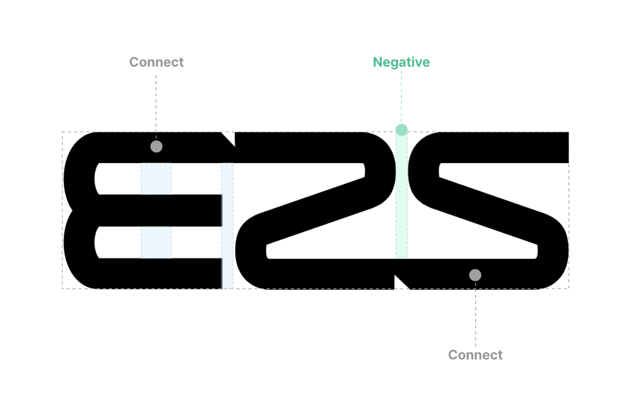
Word Mark
Wordmark breakdown
Word Mark
- The interaction of internal and external curves with angular forms represents both technical precision and user-friendly accessibility.
- E, 2, and S connect naturally to create visual flow, expressing scalable connectivity and a future-oriented network of data, technology, and people.
- Its stable and modern structure preserves visual balance and strengthens a solid, trustworthy brand image.
Logo System
Logo usage system
In practical use, maintain enough contrast and clear space according to the background and medium to preserve consistency.
- Use the primary logo on bright backgrounds.
- Always secure sufficient clear space around the logo.
- Do not arbitrarily alter the proportion, spacing, or shape.
- Use the inverse logo on dark backgrounds.
- Avoid placing it directly on visually complex imagery.
- Apply it only where contrast is clearly secured.
Color System
Brand color system
Primary and neutral tones are used together to maintain a technology-driven sense of trust and a modern brand impression.
Primary Colors
E2S Green
Deep Black Navy
Secondary / Neutral
Soft Gray
Soft Mint Tint
Primary
Key visuals, highlighted text, and emphasis points
Neutral
Card backgrounds, separators, and informational layouts
Contrast
Wordmark usage, body copy, and high-contrast areas
Application
CI application examples
The same rules can be applied across websites, signage, documents, and proposal materials.
Website
A white-based layout with rounded boxes and restrained brand color usage reinforces professionalism.
Documents / Proposals
Reports, company profiles, and proposals use the same typography and color system to maintain brand consistency.
Signage / Business Cards
Even in offline touchpoints, clear space and contrast are preserved to deliver a crisp and reliable brand image.